March 30, 2013

New Mixed Media Goodies from Christy Tomlinson

One of the things I enjoy most about mixed media art is all the stuff you get to use on one project.  If you remember a few weeks back we shared a mixed media canvas tutorial authored by design team member Melinda Miller:


Check it out here if you missed it... she did a great job and the project looks so fun!  Her canvas work was inspired by mixed media artist Christy Tomlin, who is best known for her "she art" doll canvases.   We've had her product in a few times before and it's so popular among our mixed media girls.... 

We've got some new items in from Christy that I think you're gonna love... stencils, rub ons, and text coffee filter paper... fun, fun, fun!!!

Rub Ons


Stencils


Text Coffee Filters


Just be sure to come in and get yours quick if you're a fan.... it's going quick!

March 29, 2013

Funky New Fun from Stampotique!

How can I start this post off with anything other than "They're baaaaa-aaaccckkkk".  Seriously, these stamps bring me right to my cult classic horror-loving roots!

Our Stampotique stamps are always so popular, and we've just received a fresh shipment (If you can use the word "fresh" in reference to images that reminds you most of a zombie...).  Check out these little "beauties":


Michelle uses Stampotique stamps in her art journals and it's easy to see why - they really do have a unique way of conveying your feelings!  If you're a fan come and get your favorites before they zombie-walk out the door!

March 28, 2013

More Tim! More Tim!! More Tim!!!

The last few stragglers of the recent Tim Holtz release are finally here - YAY!!!  Which ones have you been waiting for?


 Ooohh la la.... does he know what we like, or what?  I love that clean, simple alphabet font... and the pocket watch - wow!  How many ideas are going to come from that one simple die?  Just think of all the things you could add to yours... hmmm.... gotcha thinking?  Good!  Come in and get your watch die before time runs out!  (hee hee hee... I crack myself up!)

and we HAVE THE CLOCK!


March 27, 2013

From the Memory Files of Heidi Swapp...

I came in to work innocently enough today, only to be confronted with my new "gotta have it" line!  Heidi Swapp brings easy style to scrapbookers with her new Memory Files product line - check it out!

This new Memory Files album is SO much fun... every turn of the page brings something new and unexpected:


We've got one of these open so you can take a peak inside... love it!

Of course there are all kinds of coordinating products that can be used in the Memory Files album, or as additions to your own favorite album.  These first few items are clear... they appear white in the picture but when you put them on the page you'll see what's behind them... totally cool!


She also created some amazing file folders that can be used for mini album projects, page add ins, and creating ephemera pockets:


Come on in and check this new line out - I think you're going to love the possibilities!

March 25, 2013

What Color is Groovy, Anyway???

One of the most frequent requests from our customers might surprise you - it's color matching.  Either they have a piece of paper they want to find cardstock for, or they have colored a stamp and want to try to match paper too it, or perhaps they have a photo and they can't find any paper to go with it.  Whichever the case, colors seems to throw a lot of people for a loop!

That particular problems pairs very well with my newest obsession - color palettes!  I just love looking at a picture and trying to decide what colors I would pick out.  Take a look at the following pictures:


Isn't that room just yummy??  Doesn't it just make you feel like you'd like to walk in and sit down?

Now check out this picture:


A completely different room, a completely different look, and a completely different feeling.  But wait - is there something similar?  I think this next picture will pull it together for you:


So at least ten of you right now are going, "But wait!  That's not a room, Tamara!"  And you'd be right.  But it has something in common with the two pictures I showed you - it has a similar color palette!  Look how the colors are pulled out of this photo on the left; for scrapbookers, this should make you think of colors to look for in your paper!  You might need different shades of color, depending on the dominant colors in your photo.  But, all the pictures show a basic color palette of yellow, blue, and green.  
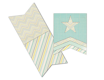
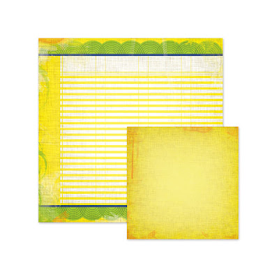
So what do those colors mean to you?  For me, they bring summer to mind.  Apparently it made the people at We R Memory Keepers feel a little groovy - hence their new collection, Feelin' Groovy!  I gotta say, this is one of my favorite color palettes and so I'm LOVIN' this collection!  Check it out:


Love the colors, love the patterns, love the vintage feel... Love it!

Of course, the great thing about paper collections is that all the color work is done for you - We R Memory Keepers even makes their own cardstock that perfectly matches their collections:


How easy is that?  Here's a few samples from the We R Memory Keepers website to inspire you:


 Aren't those colors just fabulous together?  Keep your eyes peeled - it the coming weeks I'll try to intersperse some color tips throughout my posts... you'll be a color palette expert before you know it!